
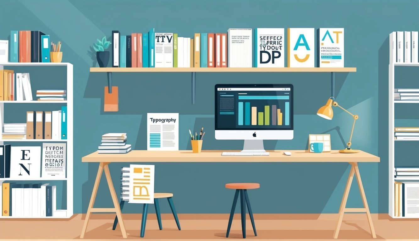
Typography is a key player in the world of design.
It’s amazing how good typography can make your message pop while bad typography, well, can send readers running for the hills.
Let’s face it: if the text looks great, people will be more likely to stick around and take in what you have to say.

Choosing the right typography program is crucial. The best tools for typography let you whip up eye-catching designs without losing your mind. They offer a plethora of options for fonts, spacing, and layouts.
This article shines a light on five top-notch programs that can elevate your typography game to new heights.
1) Rhode Island School of Design (RISD)
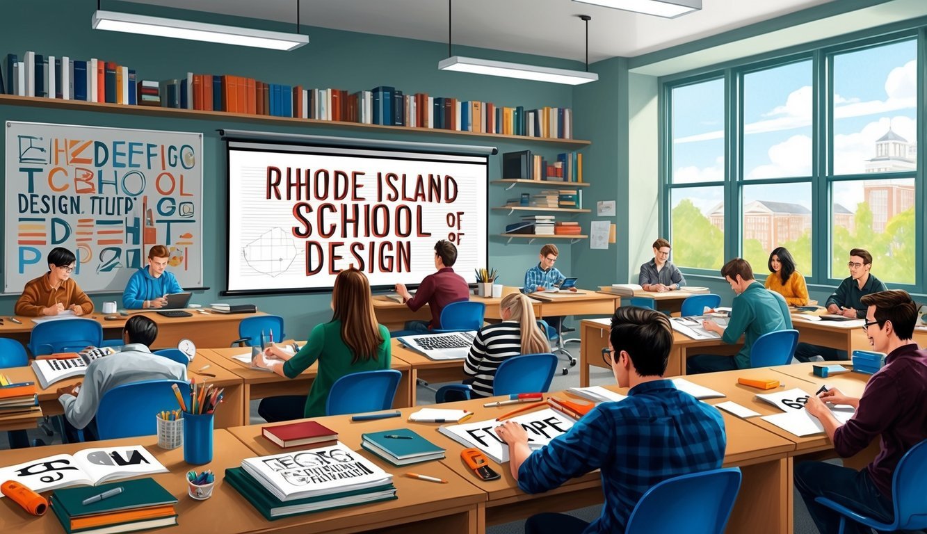
If you’re serious about typography, RISD is a fantastic choice.
Known for its incredible courses, the MFA in Graphic Design prepares you for the hustle of the design world.
You’ll dive into the social context of design, media, and the art of crafting stunning language systems.
The BFA program is all about getting hands-on with the fundamentals of typography.
Think projects like books, posters, logos, and websites.
It’s where theory meets practice!
Don’t miss Typography III—the grand finale of their typography series.
You’ll explore modern display platforms and how they reshape our writing and reading habits.
At RISD, you won’t just sit in lectures; you’ll be solving real design challenges.
They stay on top of emerging tech trends, so you’ll always have your finger on the pulse of the latest and greatest.
The coursework is rigorous but worth it.
You’ll challenge your creative boundaries and emerge as a skilled, innovative designer.
2) California Institute of the Arts (CalArts)
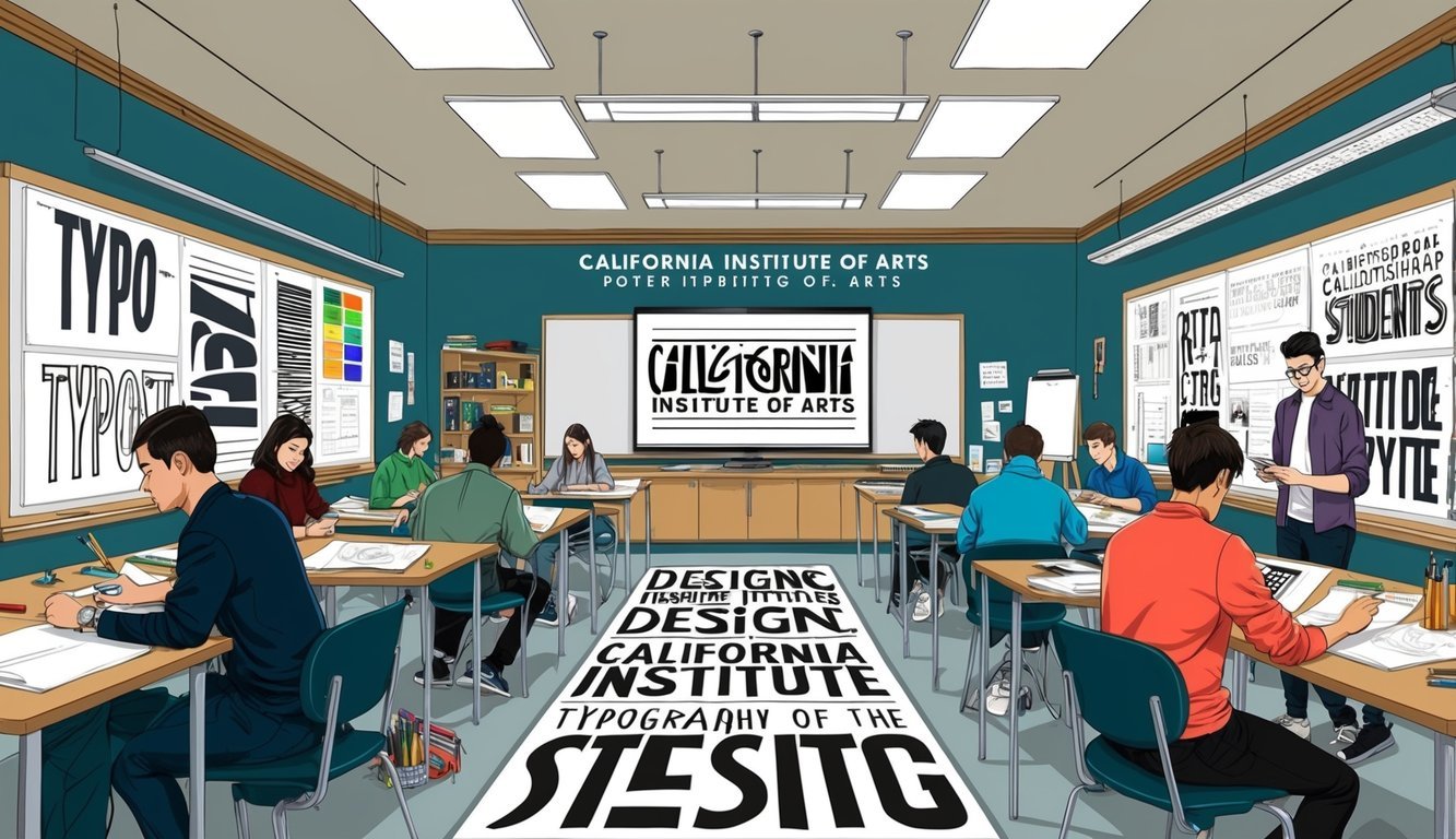
If you’re hunting for a typography program that pushes the envelope, look no further than CalArts.
Their BFA in Graphic Design is all about breaking new ground.
You won’t just learn to make things pretty; you’ll discover how to make your designs truly talk to your audience.
Want to level up? The MFA in Graphic Design is where you’ll find it all—mentorship from amazing faculty and guidance to hone your unique style.
CalArts also offers online courses through Coursera.
Their Fundamentals of Graphic Design course lets you dip your toes in topics like color, rhythm, and pattern.
You’ll even get some hands-on projects to reinforce those key design principles.
Plus, the course introduces some of the best online tools for collaborative learning, connecting you with fellow students to share feedback.
Whether you’re just starting or looking to refine your skills, it’s a great chance to explore graphic design your way.
And for those passionate about typography, their Introduction to Typography course sounds like a treat! You’ll get to manipulate text to make it both visually pleasing and meaningful.
3) School of Visual Arts (SVA) New York
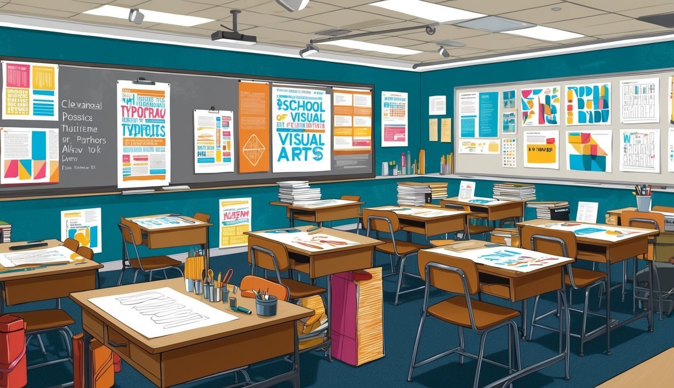
If typography is your jam, you’ve got to check out the School of Visual Arts (SVA) in NYC.
It’s a stellar spot for diving into design and visual arts.
SVA’s BFA in Design is packed with typography courses.
You’ll get to tinker with letterforms and really make them shine.
They’ve got quite the reputation too, ranked #120 in Regional Universities North by U.S. News & World Report—not too shabby!
Centrally located in NYC, the school surrounds you with inspiration and real-world typography at every corner.
The faculty consists of working pros, giving you firsthand knowledge from those in the trenches.
With a 9:1 student-to-faculty ratio, you’ll get plenty of personal attention.
Boredom? Not a chance! SVA has over 1,500 courses, offering tons of opportunities to explore typography and design in depth.
4) Savannah College of Art and Design (SCAD)
If you’re itching to dive into typography, check out the Savannah College of Art and Design (SCAD).
This place is a gem in the art world.
SCAD offers more than 40 programs across creative fields, boasting some top-notch typography courses that you’ll love.
You’ll get hands-on with cutting-edge design tools.
SCAD stays current with industry trends, ensuring you’re always learning what’s hot right now.
They’ve earned a strong reputation too—just ask The Hollywood Reporter or DesignIntelligence.
Pretty impressive, right?
SCAD has campuses in different locations, offering flexibility.
Start at one campus and finish at another if that suits your style.
Best of all, SCAD is geared toward setting you up for a successful career in design.
They’re focused on prepping you for the real world.
If typography is your passion, SCAD could be your ticket to a fantastic creative journey.
Why not take a peek?
5) Royal College of Art (RCA) London
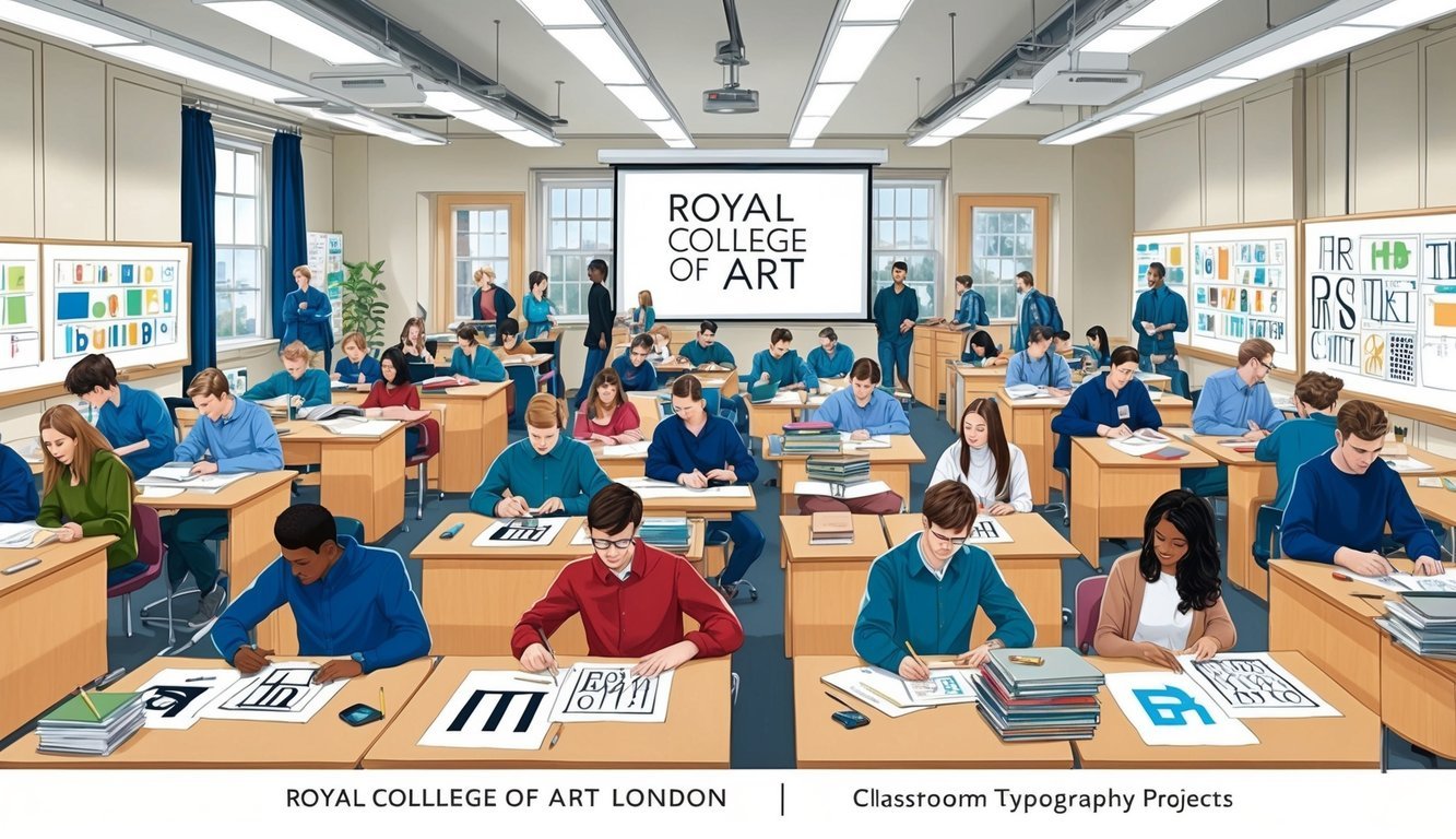
The Royal College of Art in London has some fantastic programs for typography enthusiasts.
Their Typography course blends the science and art of type, allowing you to learn the fundamentals while also expressing your creativity.
Thinking of testing the waters? Try their Typography Summer School.
It’s a fun way to pack in some typography knowledge without the long-term commitment.
If you can’t make it to London, no problem! They also have an online Typography course, letting you learn from the comfort of your home while still benefiting from RCA’s high quality.
The instructors at RCA are industry veterans, giving you the chance to learn from the best.
Plus, you’ll work with the latest design software to create incredible designs.
RCA’s programs cater to both fresh grads and seasoned pros looking to up their skills.
You might even stumble upon a new passion for letters and words!
Understanding Typography
Typography shapes how we read and understand text—it’s vital in design, directly impacting how we convey messages.
Let’s chat about its history and some essential terms to know.
History and Evolution
Typography has a rich history dating back to handwritten texts.
When the printing press arrived in the 1400s, it was a game changer, making it easier to produce books.
Fast forward to the 1900s, and computers flipped the script.
Now, anyone can jump in and create their own fonts—no expert needed!
The internet brought its own challenges.
Designers had to rethink how text appears on screens, leading us to new font styles specifically crafted for digital use.
Today, typography is everywhere—in ads, on websites, even in the apps on your phone.
Good typography can significantly enhance how well your message is understood and remembered.
Key Terminology
Getting familiar with basic terms can enhance your typography knowledge.
Here are a few must-knows:
- Font: The style of lettering you use
- Typeface: A collection of related fonts
- Serif: Those tiny lines at the ends of letters
- Sans-serif: Fonts without those little lines
- Kerning: The space between letters
Don’t forget about font weight—that relates to how bold or light letters appear.
You might hear terms like “bold” or “light” thrown around. Typography tools can help you play with these features to your heart’s content.
Line height is another important factor; it’s the space between lines.
Aim for enough space to make reading a breeze.
Cluttered text can be a real headache!
When it comes to alignment, think about how your text lines up.
You’ve got left, right, or center alignment, each with its distinct feel and uses.
Design Principles in Typography
Good typography ensures text is readable and visually pleasant.
Following these principles will help you create designs that work and look fantastic.
Balance and Alignment
Balance in typography means distributing text evenly across a page.
Nobody wants to see a lopsided design with too much empty space on one side! Pay attention to text alignment to keep things looking tidy.
Left-aligned text is often easy to read, creating a clean edge.
While centered text can look snazzy, it might not work as well for longer sections.
Using a grid is a smart way to keep everything lined up neatly.
And feel free to mix up text sizes for a bit of visual interest while maintaining balance.
Readability and Legibility
Readability refers to how easily people can grasp the text, while legibility focuses on how clear each letter appears.
Both are fundamental for good typography.
Choose fonts that are crystal clear and user-friendly.
Avoid overly ornate fonts for lengthy text.
For onscreen use, sans-serif fonts are often your best bet.
Don’t skimp on text size! If it’s too small, folks will squint to read; too big, and it hogs space.
Generally, around 16px works well for body text on websites.
Line spacing is key too—give your text room to breathe.
A good starting point for line height is about 1.5 times the font size.
And let’s talk contrast—dark letters on a light background (or vice versa) are the easiest to read.
Avoid placing text over busy backgrounds; it just complicates things.
Frequently Asked Questions

Typography programs can really elevate your design skills.
Here are some common questions about courses, tools, and key concepts to help you navigate the typography landscape.
What are the top typography courses available online?
There are fantastic typography courses you can find online. Typeface Design at RISD is a solid option.
Don’t overlook CalArts’ Graphic Design Specialization on Coursera, either.
Check out SVA’s Continuing Education offerings for great online typography classes as well.
Can you recommend any free typography courses I can take?
Absolutely! You can find some awesome free typography courses on Coursera, as well as bountiful free classes on Skillshare during their trial.
Don’t forget YouTube—you’ll find tons of free typography tutorials from seasoned pros there!
Which software tools are essential for professional typographers?
You can’t go wrong with the Adobe Creative Suite—Illustrator and InDesign are must-haves! For font design, FontLab is an awesome choice, and Glyphs is popular with Mac users.
WhatFont is also handy for quickly identifying fonts.
Could you list some colleges that offer advanced courses in typography?
RISD is a powerhouse in typography education.
CalArts is known for its innovative graphic design courses, SVA has great options in typography, and SCAD offers solid programs focused on design and typography.
Looking overseas? Check out the Royal College of Art in London!
What should I look for in a typography course syllabus?
Look for courses that cover type anatomy and classification.
Make sure they teach kerning, tracking, and leading too.
Good syllabi will also touch on font pairing and hierarchy, along with projects to bolster your portfolio.
What are some key typography concepts I’ll learn in a comprehensive program?
You’ll get a good grasp of type anatomy, including looking at serifs, x-heights, and ascenders.
Spacing is vital, so expect to nail down kerning and tracking.
Plus, you’ll dive into type classification and history, and learn the art of font pairing like a pro.