

Color theory plays a major role in art and design.
It’s more than just putting a paintbrush to canvas; it’s all about how colors interact and the feelings they evoke.
If you’re looking to step up your design game—whether you’re a seasoned pro or just starting—you might want to dive into color theory.
Trust me, it’ll help you make better choices in your projects!
Want to learn more about color theory? Online courses are a fantastic option. You can find classes tailored to your needs and schedule. These courses not only cover the basics but also give you practical experience.
Let’s take a look at some of the best online color theory courses out there!
1) Color Theory Fundamentals by CalArts on Coursera
If you’re itching to learn about color theory, you should definitely check out the Fundamentals of Graphic Design course on Coursera.
It’s part of a broader graphic design program from CalArts.
This course isn’t just about color theory; you’ll also learn the essentials of graphic design, like combining words and images.
Seriously, these building blocks are all around you in both digital and print mediums!
In the color module, you’ll actually get to play with visual rhythm and patterns.
You’ll discover how to use scale, weight, direction, texture, and space to create your compositions.
And there’s more! Typography is also on the agenda, letting you tinker with letterforms and set your own text.
How cool is that?
By the end, you’ll create a series of images using various techniques.
It’s a perfect starting point for anyone interested in graphic design, giving you a solid grounding in color theory and other key concepts.
2) Understanding Color: Color Theory Made Easy by Udemy
If you want to grasp color theory without getting lost in jargon, Understanding Color: Color Theory Made Easy on Udemy is a winner.
This course breaks down the essentials in a straightforward, digestible way.
You’ll get familiar with the core components of color—hue, saturation, and lightness—like learning the ABCs of color! Plus, you’ll dive into color schemes and harmony, which is super handy when you want to mix colors that work well together.
Think of it as the recipe for creating eye-catching designs.
No need to worry if you’re brand new to all this; this course is designed with beginners in mind.
When you finish, you’ll feel confident about using colors in art, design, or whatever creative project you have in mind!
3) Color for Designers: Exploration, Theory, & Application by LinkedIn Learning
Ready to amp up your design skills? Check out Color for Designers: Exploration, Theory, & Application on LinkedIn Learning, taught by Richard Mehl, who’s got some impressive credentials from studying with design giants like Paul Rand.
This course doesn’t just throw info at you; it’s full of hands-on projects that make learning fun.
You’ll pick up the basics of color theory while figuring out how to select colors that really pop in your designs.
You’ll leave this course with the confidence to make bold color choices.
No more second-guessing your picks!
4) Adobe Color CC: Understanding Color & Its Applications by Skillshare
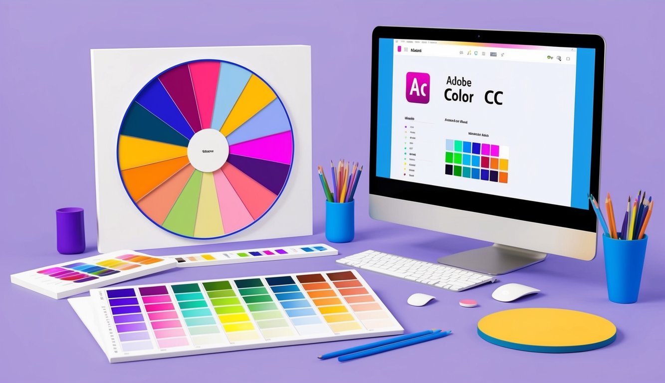
Eager to use Adobe tools for mastering color theory? Take a look at the Adobe Color CC course on Skillshare.
This course will help you harness Adobe Color CC to create stunning color schemes.
You’ll learn about different harmonies and how to apply them effectively in your work.
You’ll cover the fundamentals like primary, secondary, and tertiary colors, while also exploring terms like hue, saturation, and brightness.
The projects in this class are a blast—like making abstract designs with your chosen color scheme, which gives you a hands-on way to practice.
Another project involves creating a dimensional piece of art that shows how colors can change in different contexts.
By the end, you’ll feel like a pro using Adobe Color CC, popping colors in your designs!
Understanding Color Theory

Understanding color theory is essential as it helps you make better decisions when working in art and design.
It reveals how colors work together and how they can influence emotions.
Let’s break down some of the basics of color theory.
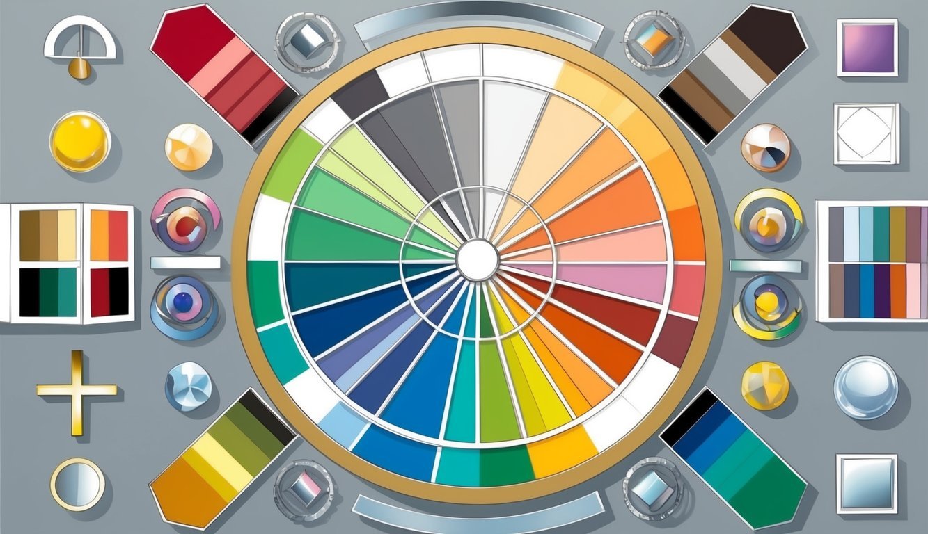
Primary and Secondary Colors
First up, we have primary colors: red, blue, and yellow.
These are your building blocks—you can’t create them by mixing other colors.
Next, we’ve got secondary colors, which are a mix of two primary colors.
Green comes from blue and yellow, while orange is made from red and yellow.
And, of course, purple is blue mixed with red.
After you’ve learned these basics, you can venture into tertiary colors, which result from mixing a primary with a secondary color, like blue-green or red-orange.
The possibilities really begin to open up!
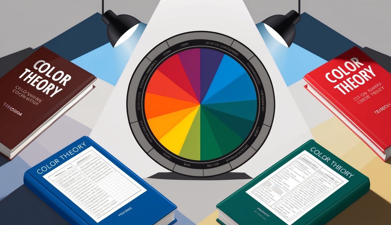
Color Harmony
Now let’s talk about color harmony, which is all about selecting colors that complement each other.
It makes your designs visually appealing!
Using complementary colors—those that are opposite each other on the color wheel, like blue and orange or red and green—can create striking designs.
Alternatively, analogous colors, which sit next to each other on the color wheel, can add a calming touch.
It’s like putting together a cozy sweater and matching scarf!
If you want to dive deeper, look into course options about color psychology.
They’ll show you how different combinations can evoke specific feelings, which can be super useful in design and marketing.
You can also experiment with triadic color schemes, which involve picking three equally spaced colors on the color wheel for a bold, balanced look.
Importance of Color in Design
Colors are a big deal in how people perceive and feel about designs.
They can shift moods and help brands stand out.
Choosing the right colors is crucial for creating effective and visually appealing designs.
Psychological Impact of Colors
Let’s chat about how colors can influence emotions.
For example, red might fire you up, while blue can give you a sense of calm.
When creating your designs, think about how you want your audience to feel.
Green often evokes nature and health, while yellow tends to bring a sense of happiness and energy.
Purple? It’s all about luxury and richness.
And remember, it’s not just about individual colors; combinations matter too.
Some pairings can grab attention, while others might feel soothing.
Cultural differences also play a role in color perception.
What’s comforting in one culture could be totally different in another.
Using Color for Branding
Colors aren’t just pretty—they’re vital for branding, too.
They help people remember and recognize your brand.
Picture Coca-Cola; do you think of that iconic red right away?
When choosing colors for a brand, consider what they convey.
Bright, bold colors might suit a kids’ toy brand, while a bank might want to embody trust with calming blues.
A top tip? Choose a primary color for your brand, along with a few secondary choices.
This keeps your branding consistent across all mediums.
You want customers to instantly recognize your brand, no matter where they come across it.
Just keep in mind that colors can look different on screens versus in print, so make sure your colors translate well everywhere!
Frequently Asked Questions
Color theory courses are diverse, catering to various skill levels and budgets.
Let’s tackle some common questions you might have about finding the right color theory class for you.
Where can I find top-notch color theory courses online?
You’ll discover great courses on popular platforms! Coursera has a solid Color Theory Fundamentals course from CalArts, and Udemy offers Understanding Color, an easy-to-follow course.
These are just a couple of choices to get you started!
Are there any free color theory courses that are worth checking out?
You bet! Many platforms provide free trials or limited free access.
You might want to explore LinkedIn Learning’s Color for Designers course, which often has a free month for new users.
What’s a good beginner-friendly intro to color theory course?
If you’re just starting, I recommend Udemy’s Understanding Color: Color Theory Made Easy.
It simplifies complex concepts into manageable sections, making it easier for newbies to catch on.
Can I learn color theory online at no cost, and if so, where?
You can definitely find free resources online! YouTube has a ton of free tutorials, and some online learning platforms offer free courses or trial periods.
Be on the lookout for limited-time deals on paid courses, too!
Which online platforms offer the best color theory classes?
Top spots for color theory include Coursera, Udemy, LinkedIn Learning, and Skillshare.
Each offers its own unique courses.
For instance, Skillshare has a course about Adobe Color CC that’s definitely worth checking out.
How do I pick a color theory course that’s right for my skill level?
Start by looking at course descriptions.
They usually indicate if they’re aimed at beginners, intermediates, or advanced learners.
Don’t skip the reviews from past students; they can provide insight into the course difficulty, helping you find the right fit.